New Digital Experience
01 Project Brief
United Way of Central and Northeastern Connecticut (UWCNC) is a non-profit organization that brings together people and resources committed to the well-being of children and families in the community.
It is a content-heavy website with multiple audiences: individual donors, company donors, non-profit donors, volunteers, and people in need.
There are 2 parts to this project:
- Redesign the main website.
- Redesign the donation site.
02 My Role
I was the lead UI/UX designer on this project, and responsible for revisiting the sitemap, creating wireframes, working with other designers to create multiple concepts for the home page, and produce all the sub level pages by myself. I also created the wireframes and prototype for the donation site.
03 Pain Points
- Original architecture was not user-friendly.
UWCNC has multiple audiences, but their information was all hidden in the secondary pages. Many child notes are under a wrong parent note.
- Original design was outdated.
04 Solutions
Although there are 5 different user categories, in a bigger picture, I put them into two groups:
1. New Users
Users who come onto the website wanting to learn about the organization. The goal for this group is to tell them the story, and the home page is our story teller. New users simply scroll and learn the story we want to tell. Therefore, the homepage needs to be appealing and informational, but also digestible.
2. Regular Users
Users who come onto the website with a task in mind. These users belong to one of the defined user categories. To create a straightforward user path for each of them, the primary navigation is a quick link to each category's landing page. And the rest of the items are put in the hamburger menu so that the site is not over-crowding.
For all groups, donation is the call-to-action we want them to take. Therefore it will be in the primary navigation, highlighted and accessible through-out the site.
Sitemap
05 Design
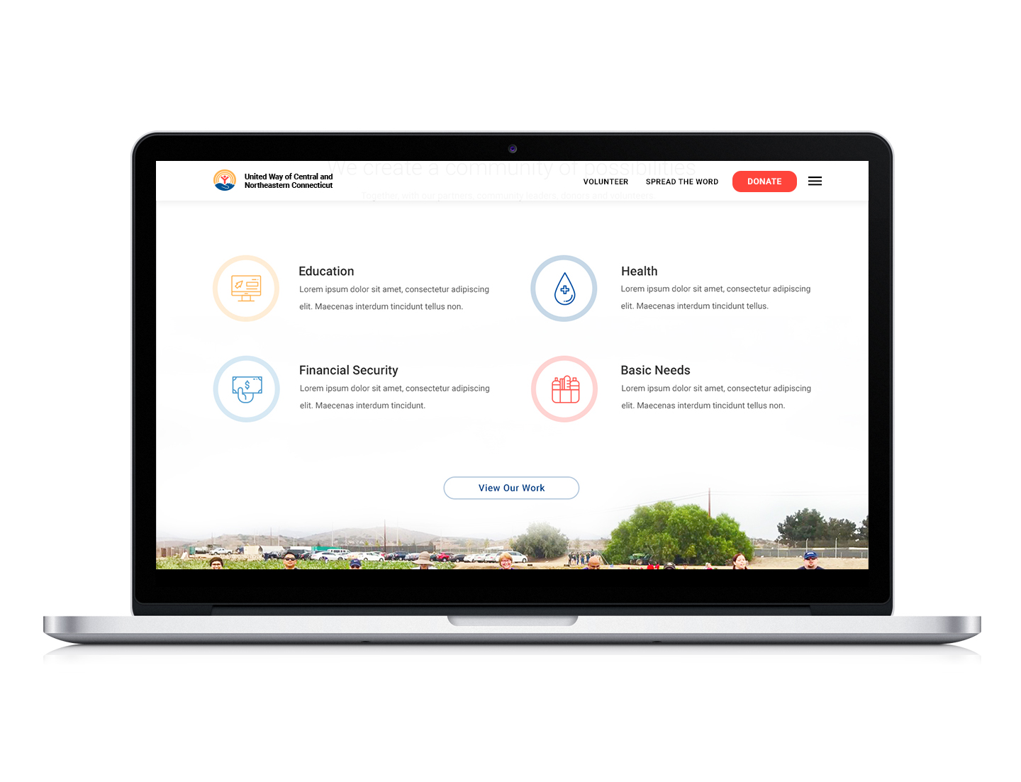
To make the website engaging and scannable, I focused on creating story-telling web pages and make sure all the information is well organized. Plus, with United Way's well-established brand, I made sure to read the style guide carefully and ensure the design adhered to it.

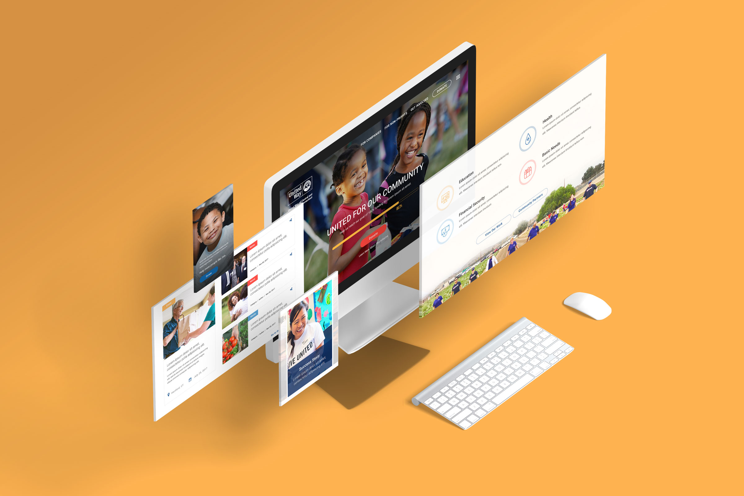
Collection of second level pages
I designed a manageable amount of containers and used them creatively on multiple pages to show how dynamic they can be. But more importantly, after handing the site over to the client, they can use these defined containers for unlimited possibilities.

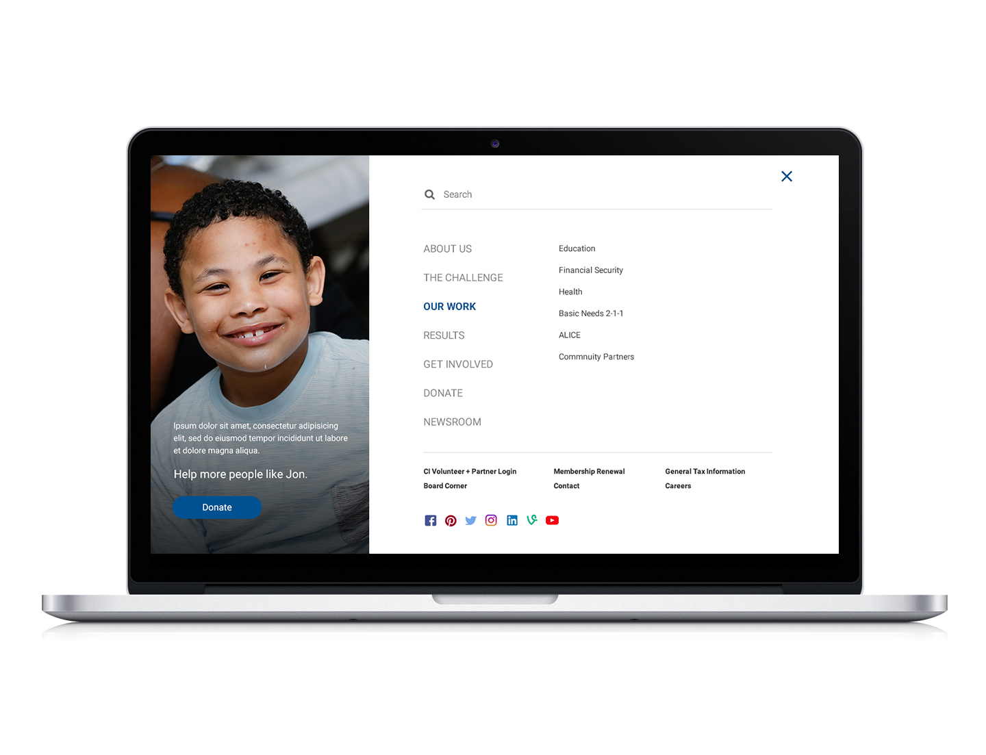
Third level page templates
LEFT: The left-column template is great for content-heavy pages that need to be broken down.
RIGHT: The right-column template is great for short and focused detail pages.
These 2-column templates gives the client 3 container styles (outlined with image, solid, and outlined) and they can be mixed and used together as they see fit.

Part Two
Donation Site Wireframe
A lot of research was done on the best practices for charity websites and its donation process. The current donation site was complicated and overwhelming with options. When designing the wireframes for the new site, I focused on simplifying the process and making it streamlined.
The solution should:
- Keep the number of fields, especially those that are required, to a minimum.
- Ensure that your donation form works on mobile devices.
- Offer dontation levels and pre-select the one you’d like most donors to choose.
The solution
The 3-step single page
This solution pre-selects and pre-fills the suggested or most common fields for users. I utilized buttons for all the options whenever possible to lessen the amount of typing from users, and to make it mobile friendly. All the non-required information is put away under "optional information" to keep the process simple and short.