From Scattered Data to Structured Intelligence
Transforming a consumer fintech app into an AI-powered operations platform, built around focus, structure, and flow.
Context
When House Numbers first launched in 2021, its mission was to help homeowners take advantage of historically low interest rates. The product analyzed each customer’s financial profile and offered insights to help them decide whether refinancing made sense for their situation.
I helped the founding team shape the brand identity, design system, and consumer experience, creating the onboarding and homeowner dashboard that introduced personalized refinancing insights.
The launch received great feedback. Customers praised the product’s clarity and intuitive data storytelling in a subject that’s often overwhelming.
As the mortgage rates rose, House Numbers pivoted from consumer refinance guidance to AI-powered operational tools for loan processors. We carried forward the same brand DNA and design system, expanding it to support new workflows, complex data structures, and AI-driven features.
Design Foundations: I helped establish House Numbers’ brand identity and design system to build trust in a data-driven product. These foundations later scaled seamlessly to support the company’s pivot into AI-powered mortgage operations.
Left: early concept and interactive prototypes to accelerate product validation and investor demos. Right: exploring different data visualization for mortgage.
Homeowner dashboard and onboarding focused on clarity, transparency and educational.
Evolving the Product
The pivot required more than a feature overhaul. It demanded a complete shift in purpose, audience, and workflow. The product moved from guiding homeowners through personal finance decisions to helping loan processors manage dozens of active files at once.
Mortgage processing is complex: each file contains piles of documents, hundreds of data points, and multiple review cycles. For processors, it often becomes a blur of data instead of a clear path forward.
As part of the pivot, I also refreshed House Numbers’ marketing collateral to communicate the new value proposition. I designed a concise one-page flyer that translated the platform’s complexity into a clear, approachable story. The piece received strong reactions from prospective customers—one remarked, “Who does your marketing? That flyer looks great!”
My role
I’ve worked with House Numbers since its early days — first defining the brand and consumer experience, then helping the product’s transition into a B2B loan-processing platform.
As the solo product designer, I partnered closely with the founder to define the product vision and lead the UX transformation, from discovery through delivery. I:
- Structured complex, interconnected data into a clear information hierarchy.
- Translated workflows into actionable user flows that mirrored real operations.
- Identified opportunities to simplify dense data and reduce cognitive load.
- Delivered a cohesive platform and continued iterating based on operator feedback.
Understanding the System
Mortgage processors operate in a state of information overload. Together with the founder, we mapped how information flowed across people, systems, and AI.
That revealed the real challenge wasn’t visual, but cognitive: helping users understand what’s next, what’s missing, and what’s safe to act on.
I hypothesised that:
If loan data were structured to mirror how processors think, they would navigate files faster and make fewer cognitive errors.
Therefore, understanding how processors operate became essential to defining the right design direction.
Mapped every data point, its relationships, and frequency of use across the loan process to clarify how information connects and evolves.
Mapping load processor’s mental priorities, dependencies, and decisions
From Insights to Design Direction
Most of a processor’s day revolved around reviewing documents: verifying details, resolving AI-flagged issues, and ensuring everything met loan requirements. When documents were ready, they updated statuses and processing dates, keeping the team aligned on what was complete or pending.
This collaboration between junior and senior processors wasn’t linear but continuous. Keeping progress accurate mattered as much as reviewing the documents themselves.
That shaped the vision: document review remained the heart of the experience, and progress tracking needed to support it — close enough to act on, quiet enough not to interrupt. The two had to feel connected, not competing, forming one seamless workflow.
The hypothesis is that Integrating progress tracking directly into the document workflow, instead of separating it, would reduce context switching and help processors stay in flow.
I translated that into user needs and design goals, ensuring the interface supported processors’ natural rhythm, reduced friction, and helped them complete their work smoothly.
User Need
Design Goal
Update statuses and dates as files progress.
Inline, always-accessible editing.
Catch missing or illogical milestones.
Visual cues to highlight missing or out-of-order dates.
Share accurate updates across systems.
Indicators for unsynced fields with LOS.
Reuse contact or loan data quickly.
Quick copy and retrieval from any view.
Work comfortably within dense data.
Work comfortably within dense data.
See who last made changes.
Show metadata and change history on hover.
These needs shaped the platform’s interaction principles:
- Clarity: users can quickly grasp progress, what’s needed, and what’s next.
- Transparency: users always know what changed, when, and why.
- Efficiency: frequent actions become lightweight and intuitive.
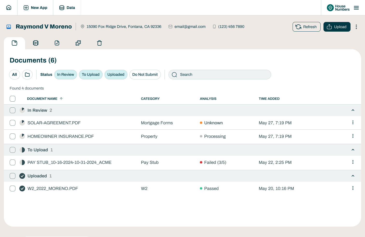
Designing for Focus and Flow
After defining the vision, it’s time to bringing it to life. The document view, designed in an earlier phase, already functioned well as a hybrid human–AI workspace. My goal was not to reinvent it but to integrate with it, building the new workflow structure around what already worked without compromising focus.
Exploring layouts
To maintain attention on the documents, I looked to products like Notion, Figma, and Linear, tools that keep the main workspace central while surfacing context on demand.
Through wireframe explorations, I tested different ways to keep progress close but secondary. We landed on a collapsible side-panel layout that allowed processors to reveal or hide contextual information as needed. Our hypothesis was that this approach would help them work more efficiently because it preserving a clean, distraction-free environment for deep document review while keeping progress tracking just one click away.
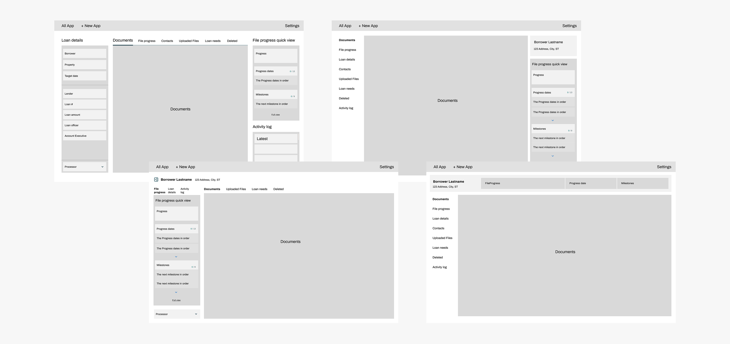
Early layouts explored how progress tracking and document review could coexist in one clear, uninterrupted workspace.
Designing for cognitive clarity: an early exploration of how to translate complex loan data into a clear visual hierarchy that highlights progress and dependencies.
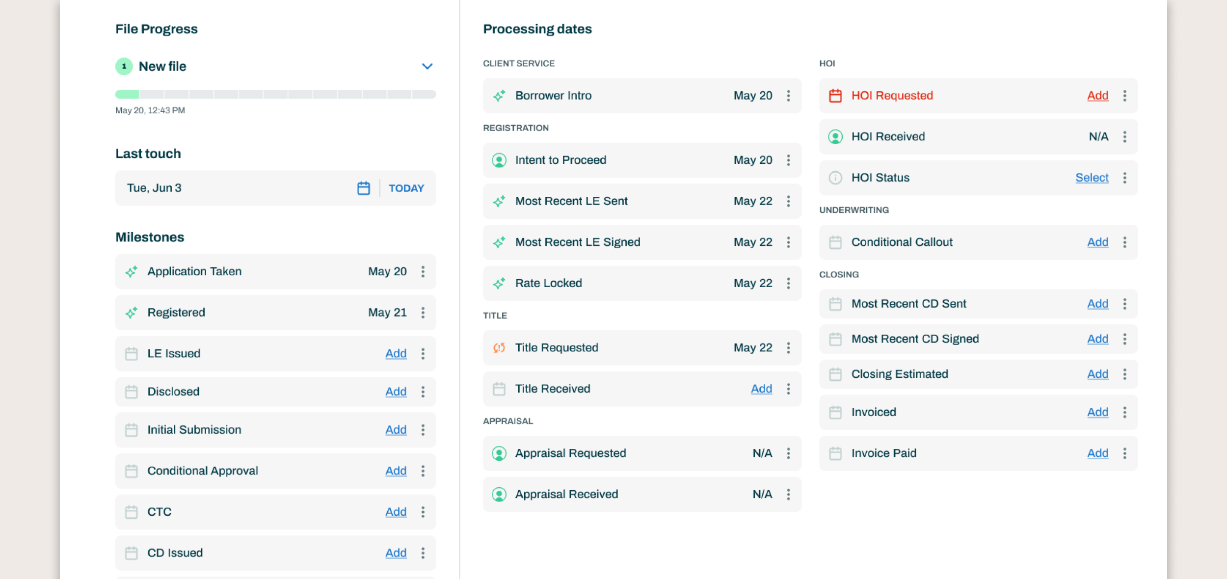
Organizing the Workflow
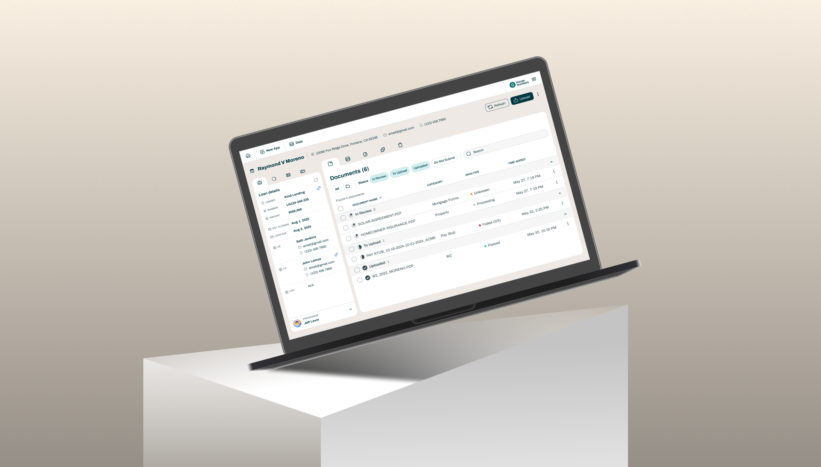
To make hundreds of data points manageable, I organized the experience into four connected panels: Loan Details, File Progress, Contacts, and Activity.
Each reflected how processors actually move through their day:
- Loan Details provided quick context when switching between files.
- File Progress highlighted what was complete, missing, or needed updating.
- Other Contacts offered a fast way to reach the right people when issues arose.
- Activity surfaced who changed what and when, building team transparency.
The panel order mirrored the natural rhythm of work, from understanding a file to progressing it to resolving issues.

Organizing data into four focused panels helped processors move confidently between context, progress, and collaboration.
Developing the Visual Language
Every piece of data carried its own complexity. Dates and statuses could come from AI, the LOS, or manual input, some missing, others out of sync. The challenge was to make this clear without overwhelming the user.
I created a compact visual language that communicated ownership and action at a glance:
- Icons indicated who made each update, whether AI, LOS, or proccessor.
- Color subtly showed what needed attention — missing, upcoming, or confirmed.
This system made accuracy visible without noise. Processors could interpret the interface intuitively, reducing cognitive load during heavy workflows.
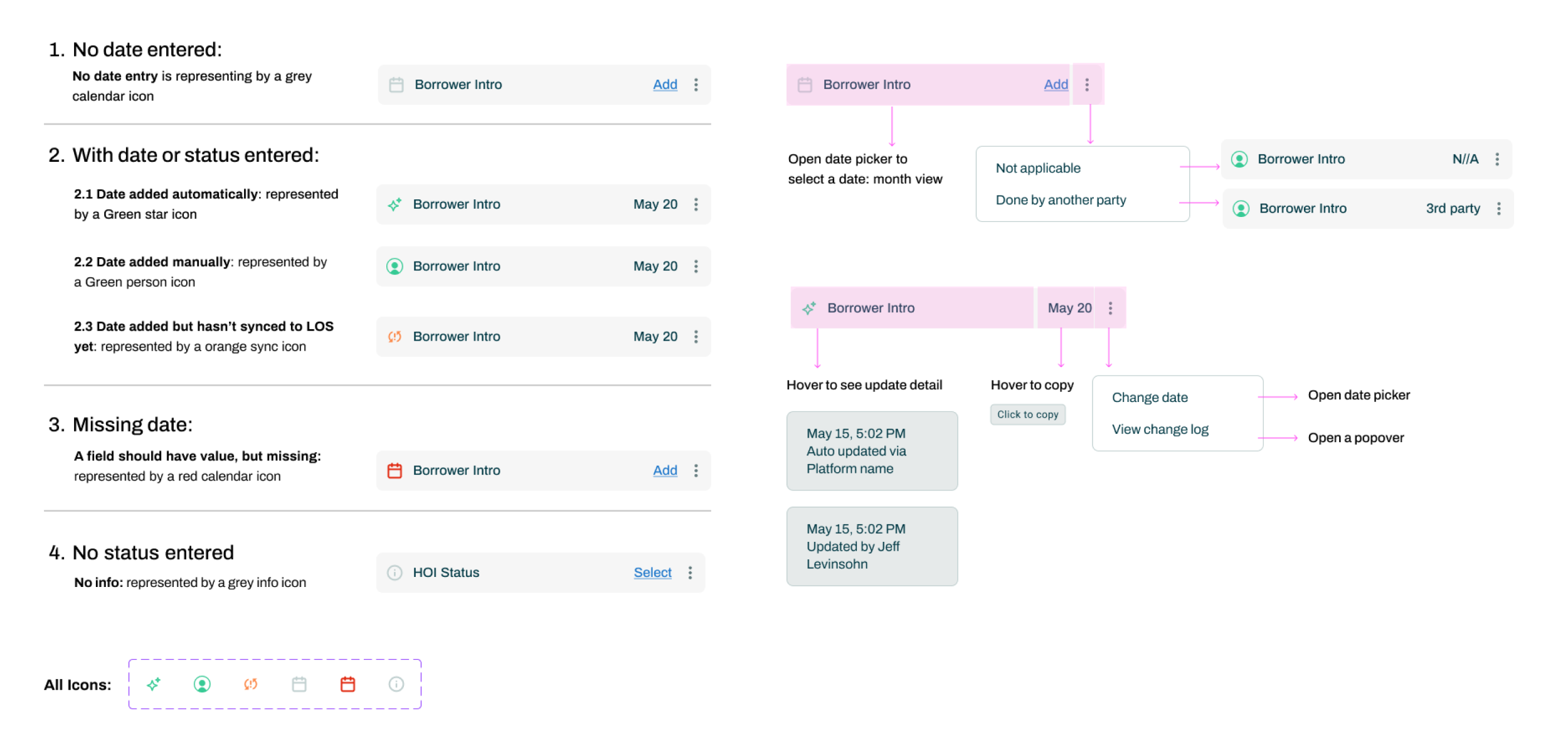
Each icon and color cue is part of a visual language that helps processors instantly understand ownership, accuracy, and next steps.
Even with over 20 data elements on screen, visual hierarchy keeps information organized, readable, and effortless to interpret.
Creating a Seamless System
- Focus View kept attention solely on documents by collapsing workflow panels.
- Quick Edit View allowed panels to open briefly for inline updates or reference.
- Expanded View revealed all milestones, statuses, and dates in one space for auditing or review.
These layers formed a seamless system that scaled with the user’s focus, allowing them to zoom in for clarity or zoom out for context while always staying in control of their workspace.
The final experience flexed to fit each processor’s needs. Every user required a different level of visibility depending on the task, and the design gave them control over how much they saw and when.
Reflection
Simple is hard. The best design often feels invisible because it brings order to complexity without asking for attention. Every interaction, from inline edits to collapsible panels, was a small act of cognitive design, helping processors stay focused, confident, and in control.
This project taught me not to be afraid of complexity, but to understand it. The key was finding the hidden relationships between data and people, and showing the right information at the right moment. When design meets users where they are and gives them control, the product quietly disappears, leaving space for people to do their best work.
Other Projects
See Project


